Re: My artwork
Posted: Sat Aug 04, 2012 3:25 pm
Huh, weird. The images don't open in Opera. They work fine in Firefox.
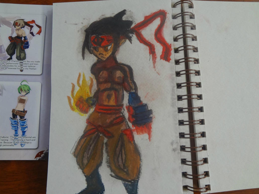
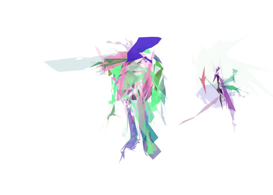
Your colors are all over the place, really bold, unbalanced, angry, high contrast. It doesn't look good. The best of the recent bunch is the guy on the bottom of page 2, with green and yellow clothes, red, yellow and brownish skin.
Your other works tend to be all cold, or all warm, dominated by a single color with no contrasting color at all. It looks one-sided, unbalanced. Try using a few different colors and getting some sort of harmony going.
Your violet face is flat. It has no third dimension. The skin looks blue, cold and dead. The face is the color of an old bruise.The hair DOES have three-dimensionality in the curving strokes, making the face look even worse for it. The hair is the color of electricity and ice, and while it doesn't look alive, it doesn't look dead. It looks like it could be moving. The skin and hair are yellow on the right, as if there was a bright light there. However, there's no clear direction for the light, you can't say if it's from the front, from the far right, or from behind. There is no shadow on the left side, the nose has a shadow ON THE RIGHT, on the side that should be in the light. There's a small, slightly lighter spot on the left, that indicates some sort of light, but since that light bright spot is weak, it couldn't cast harsh, dark shadows.
I'm not saying this because I think you're bad. You're drawing and painting, and that's very good. That's great. However, if you want to get better, you should start thinking about things a bit more. Don't copy straight from the books, LEARN from the books.
Ask yourself questions - why did the artist draw it like this? Why is this darker? Why is this red and not yellow?
If you're coloring a character, don't choose the colors yourself. Choose the colors from the book - but use a picture or character! Don't just look at "how to draw" books, but also at art books, at books with great paintings and drawings, anime or not.
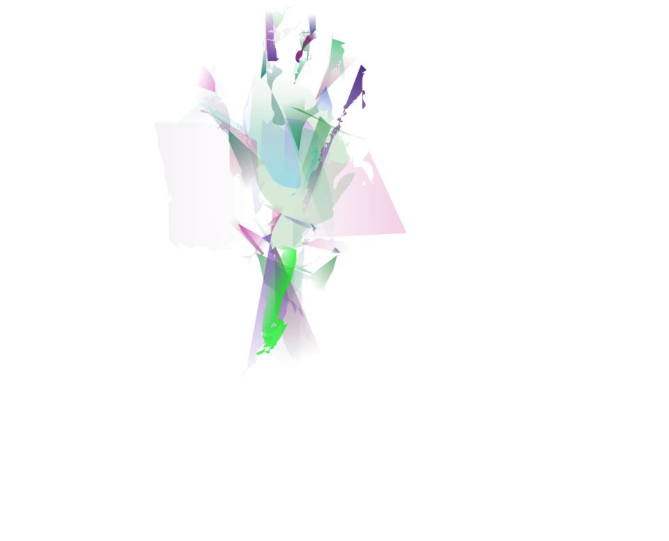
Do more exercises like the last one you posted, all random blots - but small, VERY small! Make something the size of a playing card - no characters, just nice colors. Take the colors of some image that has colors you like. Then, once you've done that a few times, try doing a few exercises that are smaller, just the size of a matchbox. Why? So that you have no space to add in too much detail, and so that you can do many of them. Make two dozen, put them on a wall, and choose the three best ones. Compare those three to images you like, and try to find out why they work.
Your colors are all over the place, really bold, unbalanced, angry, high contrast. It doesn't look good. The best of the recent bunch is the guy on the bottom of page 2, with green and yellow clothes, red, yellow and brownish skin.
Your other works tend to be all cold, or all warm, dominated by a single color with no contrasting color at all. It looks one-sided, unbalanced. Try using a few different colors and getting some sort of harmony going.
Your violet face is flat. It has no third dimension. The skin looks blue, cold and dead. The face is the color of an old bruise.The hair DOES have three-dimensionality in the curving strokes, making the face look even worse for it. The hair is the color of electricity and ice, and while it doesn't look alive, it doesn't look dead. It looks like it could be moving. The skin and hair are yellow on the right, as if there was a bright light there. However, there's no clear direction for the light, you can't say if it's from the front, from the far right, or from behind. There is no shadow on the left side, the nose has a shadow ON THE RIGHT, on the side that should be in the light. There's a small, slightly lighter spot on the left, that indicates some sort of light, but since that light bright spot is weak, it couldn't cast harsh, dark shadows.
I'm not saying this because I think you're bad. You're drawing and painting, and that's very good. That's great. However, if you want to get better, you should start thinking about things a bit more. Don't copy straight from the books, LEARN from the books.
Ask yourself questions - why did the artist draw it like this? Why is this darker? Why is this red and not yellow?
If you're coloring a character, don't choose the colors yourself. Choose the colors from the book - but use a picture or character! Don't just look at "how to draw" books, but also at art books, at books with great paintings and drawings, anime or not.
Do more exercises like the last one you posted, all random blots - but small, VERY small! Make something the size of a playing card - no characters, just nice colors. Take the colors of some image that has colors you like. Then, once you've done that a few times, try doing a few exercises that are smaller, just the size of a matchbox. Why? So that you have no space to add in too much detail, and so that you can do many of them. Make two dozen, put them on a wall, and choose the three best ones. Compare those three to images you like, and try to find out why they work.


 I hope this shows my crazy love for you.