Wordpress blog

Anything else
User avatar
Wilbefast
Posts: 1204
Joined: Wed Dec 31, 2008 2:32 pm
Location: In a sealed box shielded against environmentally induced quantum decoherence
Contact:

Re: Wordpress blog

Post by Wilbefast » Thu Mar 25, 2010 4:49 pm

Image Image Image Image Image Image

That's from a tutorial I made a while back for the Gamemaker board - I won't copy paste any of the details: check it out.

BTW - don't be alarmed: all I've done with the CSS so far is figure out where each of the fields is, using placeholders (the header became a head, the side'bah' became a sheep, etc). I was thinking I'd do a full page, slightly transparent background using a sort of collage of eclectic sprites - in other words, something like what the covers of all my exercise books look like :P Pity I don't have a scanner or I'd show you what I mean. There's actually some good Overgrowth fan-art I did on paper - mice are so hard to draw with!

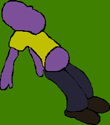
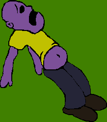
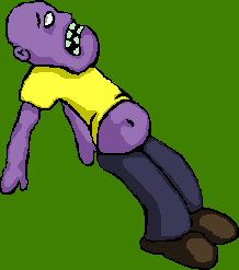
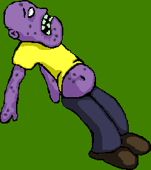
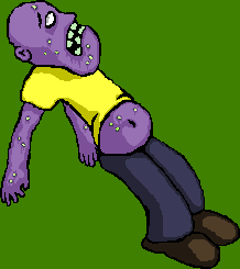
Um yeah - bit of a tangent there. Anyway, here's a few old/new sprites I've assembled over the years:

Image

Or I might do some new custom ones (might be a bit old otherwise).

Thoughts?

User avatar
TheBigCheese
Posts: 856
Joined: Sun Feb 08, 2009 11:01 am
Location: Lost in the Alps.

Re: Wordpress blog

Post by TheBigCheese » Sat Mar 27, 2010 4:12 pm

Certainly can't hurt to repost the tutorial, since I doubt many would have seen it already.

Looking good, though. Can't wait to see how the template turns out.

User avatar
Wilbefast
Posts: 1204
Joined: Wed Dec 31, 2008 2:32 pm
Location: In a sealed box shielded against environmentally induced quantum decoherence
Contact:

Re: Wordpress blog

Post by Wilbefast » Sat Mar 27, 2010 6:00 pm

This is all good practice using CSS - I have an exam coming up: some kind of IT certificate that all University students are supposed to pass...
Image

Image

Image

Unforeseen consequences - I made my images see-through so they'd (in theory) fit well on any background. Of course, the text is now indecipherable. I'll have to go back and change them all :|

Image

In the meantime, what do you think of the design so far?

User avatar
Armored Wolf
Posts: 1267
Joined: Mon May 25, 2009 7:35 am
Location: In Renegade_Turner's brain

Re: Wordpress blog

Post by Armored Wolf » Sat Mar 27, 2010 7:46 pm

Too colorful... looks like a movie interpretation of an acid trip.

User avatar
TheBigCheese
Posts: 856
Joined: Sun Feb 08, 2009 11:01 am
Location: Lost in the Alps.

Re: Wordpress blog

Post by TheBigCheese » Sat Mar 27, 2010 10:01 pm

Armored Wolf wrote:Too colorful... looks like a movie interpretation of an acid trip.
I don't think the pink one was meant to be the final.

But for the 3rd image, it looks awesome! :mrgreen:
Not sure about text readability, since it's not up officially (at least not when I visit the link), but it looks like it'll be fine.

Maybe the only critique would be to watch out for pure black backgrounds. A lot of the time it can be overwhelming. I really like the green thing and the red guy on the right, though.

User avatar
Endoperez
Posts: 5668
Joined: Sun Jan 11, 2009 7:41 am
Location: cold and dark and lovely Finland

Re: Wordpress blog

Post by Endoperez » Sun Mar 28, 2010 3:13 am

Yeah, look out so that it doesn't become too dark. Could you perhaps use some background image instead of a single block of color? I don't know what'd fit... Perhaps a dark sky with few constellations visible in it?

User avatar
Wilbefast
Posts: 1204
Joined: Wed Dec 31, 2008 2:32 pm
Location: In a sealed box shielded against environmentally induced quantum decoherence
Contact:

Re: Wordpress blog

Post by Wilbefast » Sun Mar 28, 2010 10:49 am

Better? Worse?

Image

Not sure about the header-cat, but then it did take a while to do :?

There we go - sunk-cost fallacy!

User avatar
tokage
Posts: 615
Joined: Sat Dec 13, 2008 12:24 pm
Location: In a meat machine

Re: Wordpress blog

Post by tokage » Sun Mar 28, 2010 11:20 am

I liked the simple one better, but both are quite good.

User avatar
Glabbit
Posts: 4917
Joined: Sun Feb 06, 2005 8:38 am
Location: A mile away, with your shoes!

Re: Wordpress blog

Post by Glabbit » Sun Mar 28, 2010 12:47 pm

My vote goes to the new one!

User avatar
Wilbefast
Posts: 1204
Joined: Wed Dec 31, 2008 2:32 pm
Location: In a sealed box shielded against environmentally induced quantum decoherence
Contact:

Re: Wordpress blog

Post by Wilbefast » Sun Mar 28, 2010 1:01 pm

People wanted lighter so... :?

Tokage: what changes don't you like precisely?

Oh, and thanks for the comment - it's like my 4th (I treasure each and every one of them) :D

User avatar
tokage
Posts: 615
Joined: Sat Dec 13, 2008 12:24 pm
Location: In a meat machine

Re: Wordpress blog

Post by tokage » Sun Mar 28, 2010 1:42 pm

Ok, misunderstanding, ... with the 'simpler one' I meant the one with the cat faces in the heading. As I said, both new versions are nice, but I think the plain sides are better and the long cat looks a bit weird to me. And I like the cat faces...

User avatar
Endoperez
Posts: 5668
Joined: Sun Jan 11, 2009 7:41 am
Location: cold and dark and lovely Finland

Re: Wordpress blog

Post by Endoperez » Sun Mar 28, 2010 2:03 pm

I've been wondering about your choice of colors for some time - for example, the sprite guy for the gamemaker board is almost an eyesore. The strong, bold colors repeat in your sprites and in your website design - a magenta background would be too distracting for me, for example, even for testing. I'm not sure if you've had any artistic training, but it's a bit weird having all of these strong colors side to side. It's fine if you're doing it on purpose, but if not, I think it'd be worth looking into color theory or something if you get a chance.

User avatar
Armored Wolf
Posts: 1267
Joined: Mon May 25, 2009 7:35 am
Location: In Renegade_Turner's brain

Re: Wordpress blog

Post by Armored Wolf » Sun Mar 28, 2010 2:26 pm

Wilbefast wrote:
Image

!
Much better, this design I quite like. Cat looks a bit odd, but you're not designing this blog for me and I will probably never read it, so don't take too much from my opinion.

User avatar
Wilbefast
Posts: 1204
Joined: Wed Dec 31, 2008 2:32 pm
Location: In a sealed box shielded against environmentally induced quantum decoherence
Contact:

Re: Wordpress blog

Post by Wilbefast » Sun Mar 28, 2010 10:01 pm

Endoperez wrote:I've been wondering about your choice of colors for some time - for example, the sprite guy for the gamemaker board is almost an eyesore. The strong, bold colors repeat in your sprites and in your website design - a magenta background would be too distracting for me, for example, even for testing. I'm not sure if you've had any artistic training, but it's a bit weird having all of these strong colors side to side. It's fine if you're doing it on purpose, but if not, I think it'd be worth looking into color theory or something if you get a chance.
I've never had any artistic training, and I'm slightly colour-blind, so I pick strong contrasting colours to make up for it :wink:

I'll look into colour theory though...

User avatar
Endoperez
Posts: 5668
Joined: Sun Jan 11, 2009 7:41 am
Location: cold and dark and lovely Finland

Re: Wordpress blog

Post by Endoperez » Thu Apr 01, 2010 8:43 am

If you're not sure about which colours work well, you could look through a site like colourlovers and find something interesting.

I got a colour scheme for my portfolio site (still offline because I don't have enough good stuff to put into it) from the site, this palette specifically:
http://www.colourlovers.com/palette/974 ... k_or_treat!

I think it's much easier to recognize a set of colours you like, than to come up with a good combination of colors.

Post Reply