Fan Art

Anything related to Wolfire Games and/or its products
User avatar
Endoperez
Posts: 5668
Joined: Sun Jan 11, 2009 4:41 am
Location: cold and dark and lovely Finland

Re: Fan Art

Post by Endoperez » Tue Jun 15, 2010 11:08 am

Nice! :D

I really like your style. Lots of detail in some parts, and very little in others, and soft and smudged in some parts but well-defined in others. I'm glad to have been of help, especially as I couldn't do stuff like that myself! :D

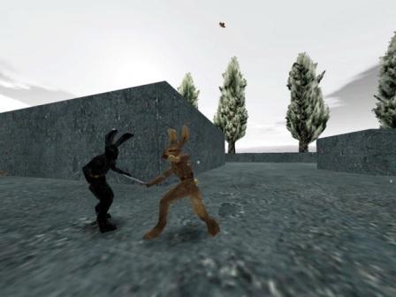
I'll offer a little critique again. I don't think the tree leaves should be that bright in a cloudy day, and the green is also more saturated than the other colors in your screen. They're good-looking trees, but I think they'd fit better into a different scene.


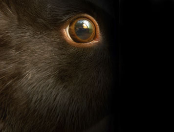
Second, black is black only in the dark. In the light, black is full of colors, usually grays but sometimes browns or blues as well. I think the rat and the rabbit would work better if they were very dark brown or red or blue, instead of black.


Not medium-gray, but a gray that's dark enough to look black at a first glance. This post doesn't have a single pure-black letter!


Image

User avatar
Dreamer
Posts: 10
Joined: Fri May 14, 2010 11:52 am
Location: Greece

Re: Fan Art

Post by Dreamer » Wed Jun 16, 2010 12:50 pm

Thanks soooo much! :oops: :D

Thanks for the critique it really helps! Yeah maybe the trees don't fit properly... but I had NO idea of what could fill the sides. Maybe rocks? Or those cubical-granite-structures in Lugaru?
http://www.mydigitallife.info/wp-conten ... lugaru.jpg

Mmm... hadn't thought of that... :oops:
lol!

Thanks again!! You've helped me improve allot (I think at least :oops: )
:D All right! I will continue drawing!! Wait for the next! (please? :D )

PS: sorry for my English but what do you mean by:"This post doesn't have a single pure-black letter!"??

THanks again! :D

User avatar
Freshbite
Posts: 3256
Joined: Thu Jan 14, 2010 12:02 pm
Location: Stockholm, Sweden.

Re: Fan Art

Post by Freshbite » Wed Jun 16, 2010 1:01 pm

He colored his post with colors resembling the default color to prove a point.
These are the colors he used, compare them to the original posting color.

█████ -- #103010
█████ -- #002030
█████ -- #203550

█████ -- #333333 (Original)

WallyWorld
Posts: 57
Joined: Sat May 22, 2010 2:21 pm

Re: Fan Art

Post by WallyWorld » Wed Jun 16, 2010 1:48 pm

sneaky

User avatar
Dreamer
Posts: 10
Joined: Fri May 14, 2010 11:52 am
Location: Greece

Re: Fan Art

Post by Dreamer » Wed Jun 16, 2010 9:49 pm

Freshbite wrote:He colored his post with colors resembling the default color to prove a point.
These are the colors he used, compare them to the original posting color.

█████ -- #103010
█████ -- #002030
█████ -- #203550

█████ -- #333333 (Original)
Oh now I get it!lol! Thanks! But even if you say so I cant see the difference! :oops: :D Maybe some eye problem lol!

User avatar
Endoperez
Posts: 5668
Joined: Sun Jan 11, 2009 4:41 am
Location: cold and dark and lovely Finland

Re: Fan Art

Post by Endoperez » Wed Jun 16, 2010 11:58 pm

Dreamer wrote:Thanks soooo much! :oops: :D

Thanks for the critique it really helps! Yeah maybe the trees don't fit properly... but I had NO idea of what could fill the sides.
The trees could be there, but the leaf color doesn't quite fit.

Here's a poor edit of your picture. I changed the color of the tree leaves, and made the fighters gray instead of black. The characters are really poor, but I just wanted to demonstrate the point. I'll also post the original for comparison:

Image
Image
Oh now I get it!lol! Thanks! But even if you say so I cant see the difference! :oops: :D Maybe some eye problem lol!
More probably a problem with your computer monitor. Brightness, contrast and gamma all affect how well you can tell the differences between very bright and very dark colors, and the quality of the monitor itself, too. There are online guides for calibrating your monitor, you could check one of those.
Basically, what you see in your monitor and what I see in my monitor can be VERY different, even though if they are printed out, they look exactly the same. However, if the prints are scanned, the scans will once again look different. So it could be that the changes in the above image, which look good on my computer, look bad on yours.

User avatar
Dreamer
Posts: 10
Joined: Fri May 14, 2010 11:52 am
Location: Greece

Re: Fan Art

Post by Dreamer » Thu Jun 17, 2010 12:48 pm

lol! Thanks for the trouble! :D

User avatar
Dreamer
Posts: 10
Joined: Fri May 14, 2010 11:52 am
Location: Greece

Re: Fan Art

Post by Dreamer » Tue Jun 22, 2010 12:13 am

Hello again! :D
This time I asked permission from Aperson4321 http://aperson4321.deviantart.com/ and made this cool rabbit on the AWESOME background he made! Check it out! :wink:
Attachments
The_Leap_by_aperson4321_and_GrDreamer.png

User avatar
Endoperez
Posts: 5668
Joined: Sun Jan 11, 2009 4:41 am
Location: cold and dark and lovely Finland

Re: Fan Art

Post by Endoperez » Tue Jun 22, 2010 1:36 am

Dreamer wrote:Hello again! :D
This time I asked permission from Aperson4321 http://aperson4321.deviantart.com/ and made this cool rabbit on the AWESOME background he made! Check it out! :wink:
Nice! It fits very well together. It also looks like Aperson has been doing lots of perspective practice, and has also learned a new trick or two with brushes. There some very nice small detail in that picture.

User avatar
Glabbit
Posts: 4917
Joined: Sun Feb 06, 2005 5:38 am
Location: A mile away, with your shoes!

Re: Fan Art

Post by Glabbit » Tue Jun 22, 2010 3:34 am

That picture reminds me of Assassin's Creed overly much.
Not that that's a bad thing, it just takes away from it a bit 'cos I'm thinking of that instead of the picture type of thing.

Still, it's a sweet picture. Love the rawness. Also that's some sweet depth in there.

User avatar
Dreamer
Posts: 10
Joined: Fri May 14, 2010 11:52 am
Location: Greece

Re: Fan Art

Post by Dreamer » Tue Jun 22, 2010 4:24 am

Endoperez wrote:Nice! It fits very well together. It also looks like Aperson has been doing lots of perspective practice, and has also learned a new trick or two with brushes. There some very nice small detail in that picture.
Thanks! :D Yeah he really made it awesome! :lol:

User avatar
Dreamer
Posts: 10
Joined: Fri May 14, 2010 11:52 am
Location: Greece

Re: Fan Art

Post by Dreamer » Tue Jun 22, 2010 4:28 am

Glabbit wrote:That picture reminds me of Assassin's Creed overly much.
Not that that's a bad thing, it just takes away from it a bit 'cos I'm thinking of that instead of the picture type of thing.

Still, it's a sweet picture. Love the rawness. Also that's some sweet depth in there.
lol thats ok! :D
Thanks for the comment! Note that another Aperson made the cool background! :mrgreen:

Xtrinsic
Posts: 3
Joined: Wed Jul 21, 2010 5:09 pm

Re: Fan Art

Post by Xtrinsic » Wed Jul 21, 2010 5:40 pm

Evenin' Everyone!

This is my first post here on the forums, my brother introduced me to this great game! I'm currently going to school for Game Design/3d Art and Animation, so I follow the blog with great interest! With alot of persausion, he also got me to do some fan art. Scribbled this up over the last hour, so its still rather unfinished. Any input would be greatly appreaciated and if anyone as a tip on how to do fur, I'll worship you!

Cheers! :)
Attachments
Dogsoldierb Kopie.jpg

User avatar
Untadaike
Posts: 1660
Joined: Mon Jan 05, 2009 4:46 pm
Contact:

Re: Fan Art

Post by Untadaike » Wed Jul 21, 2010 6:30 pm

Dude, the armor flaps are really detailed! That's really cool! Love it. Can't help you with the fur, though.

Xtrinsic
Posts: 3
Joined: Wed Jul 21, 2010 5:09 pm

Re: Fan Art

Post by Xtrinsic » Wed Jul 21, 2010 6:40 pm

Untadaike wrote:Dude, the armor flaps are really detailed! That's really cool! Love it. Can't help you with the fur, though.
Thank you very much! I'm glad you think so.I think I'm going to try and concept what ferrets might look like next or something, after all, practice makes perfect! :D

Post Reply