
Also his left hand fingers was too short so i tryed to make them little longer.
Fan Art
Re: Fan Art
I hope ShinyGem don't get to mad at me for makeing this quic fix for his latest art
Edit: i did'nt like that cats neck that was sitting by the fire, it was just to long lor me.
Also his left hand fingers was too short so i tryed to make them little longer.
Also his left hand fingers was too short so i tryed to make them little longer.

Re: Fan Art
Hm, I like the lighted one more for color, but the gray one shows off the darkening better. Having darkened does improve it quite a bit. If you watch some of Aubrey's speed paints, you'll see he darkens up quite a lot, so experiment with it and see how much you like to use. It does create some needed contrast though, and it made your art quality 'jump' a little. Just looks more refined when you darken your stuff.
I'll leave details and such to other people, but it looks pretty good.
I'll leave details and such to other people, but it looks pretty good.

Re: Fan Art
Here's the pic after using SumoPaint's "Auto Tone" filter and some other stuff. Don't be afraid to have darker backgrounds, especially on "night" pictures.
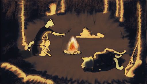
That looks like night, because outside of the light's area it's dark. Your original picture looks like a a light, cloudy day, because the environment is very bright, with no harsh shadows, but the light is gray instead of warm yellow it'd be in direct sunlight. And it's DAY, not night, or even evening, because it's light everywhere. The firelight is only a tiny bit brighter than the overall lighting. Something like this isn't very dramatic.
A dark blue night background is often a good contrast against the light, warm yellows and reds of the fire.

Re: Fan Art
Endoperez's looks pretty good, Last's as well, you guys quite improved it. Also thanks Silverfish and Korban for the help! Can I get a Huzzah for community teamwork?! =D
And, since I'm feeling better today, I'll start it with two more drawings, a sea dog and a sea bunny! Originally they'd be on a ship and on the same picture, like a pirate crew, but I think I'll have to practice making "complete scenes" a lot more before they look passable.
Sea Dog
Sea Bunny
P.s: Colouring of those and last week's drawings will be my next assignment!
Edit: Here's a colouring of my previous drawing Samura(bb)i(t). The top Kanji is "aku", meaning evil/bad and the bottom is "usagi", hare/rabbit. Hopefully I got your tips right. =)
Samura(bb)i(t)
And, since I'm feeling better today, I'll start it with two more drawings, a sea dog and a sea bunny! Originally they'd be on a ship and on the same picture, like a pirate crew, but I think I'll have to practice making "complete scenes" a lot more before they look passable.
Sea Dog
Edit: Here's a colouring of my previous drawing Samura(bb)i(t). The top Kanji is "aku", meaning evil/bad and the bottom is "usagi", hare/rabbit. Hopefully I got your tips right. =)
Samura(bb)i(t)

Re: Fan Art
He looks like he should be old, but the right side of his face is startlingly young looking. It's disconcerting. Good job though, I like it. The others are good too, but sea dogs telescope looks like its pointing weirdly with relation to his eye. It should be pointed the same way as his face, but it seems off. Also the fake leg seems too modern, though it is cool. Good work as always!
Re: Fan Art
Hm, his face does look a little young. I think it is how the eye is. If it looked more tired, maybe a slight bag under the eyes he would look like he'd been through more. But that background is a nice contrast and you didn't over-color it. I think this one looks good.
Re: Fan Art
I agree, although his right lip isn't sagging as much as the left, also slightly contributing to its youngness. You should over exaggerate both sides, that would be pretty awesome.
Re: Fan Art
I made a new Endoface, and I can pretty much guarantee it is NSFW, so check your 6 for da' boss!
This popped up in the Randomness forum when Jack, adwuga and I were talking about swooshing
This popped up in the Randomness forum when Jack, adwuga and I were talking about swooshing
- *swoosh*
- Endoface_pants.jpg (99.81 KiB) Viewed 5756 times

Re: Fan Art
Awesomely drawn, Ylvali! I looked at it a couple of times, I cringed every time at that beheaded bunny. I also am noticing a distinct lack of pants on the most recent pictures...
Anyways, coloured sea bunny, and I'll fix and colour the dog next. The only problem I see with the dog's peg leg is that I'm not sure how to make it not modern looking, if I make it straight, it won't fit with his natural leg, maybe I'll add some sort of belt or rope, I don't know.
Sea Bunny
Anyways, coloured sea bunny, and I'll fix and colour the dog next. The only problem I see with the dog's peg leg is that I'm not sure how to make it not modern looking, if I make it straight, it won't fit with his natural leg, maybe I'll add some sort of belt or rope, I don't know.
Sea Bunny
Re: Fan Art
Damn thats hot. Gonna take this to the bathroom.Ylvali wrote:
Re: Fan Art
Sea dog coloured! I'm trying to work with new stuff, I kinda gave him a "aura"- sort of - background, fixed his peg leg to look older, I hope it's better now, and fixed the telescope's angle I think, it still feels a bit off, but I almost cut a hole through the paper trying to get it right...
Sea Dog
P.s: Should I take a stab at a Platypus man?
Sea Dog
Last edited by ShinyGem on Fri Dec 02, 2011 4:21 am, edited 1 time in total.
Re: Fan Art
Looks good to me. Yes, platipie are awesome.
Re: Fan Art
Haha, when I saw that picture of the cat lady and the decapitated rabbit, my first thought was "Crazy bitch." and then it was "Hey, like my sister." and then "Wait, that's a cat and not a dog." Nice drawing
And I like what you did with the Sea Dog. I think looks cool, and that peg leg looks more fitting as well. The aura thing is cool looking, but it threw me off because I'm used to your art not having it XD It's not bad or anything, just unexpected.
And I like what you did with the Sea Dog. I think looks cool, and that peg leg looks more fitting as well. The aura thing is cool looking, but it threw me off because I'm used to your art not having it XD It's not bad or anything, just unexpected.
Re: Fan Art
Here it is, platypus man, very platypus, not so much man, but still...
Anyway, he's a male platypus, he has the venomous spurs, protecting his wife's eggs! Ah, platypuses are such astonishing creatures. =D
Platypus Papa
Anyway, he's a male platypus, he has the venomous spurs, protecting his wife's eggs! Ah, platypuses are such astonishing creatures. =D
Platypus Papa