Page 142 of 146
Re: Fan Art
Posted: Fri Apr 03, 2015 10:09 am
by rodeje25
What did you write there? Can't read it
Re: Fan Art
Posted: Fri Apr 03, 2015 10:36 am
by EPR89
Thomason1005 wrote:RIP Phoenix engine
A bit over-dramatic.
David said that he's considering to publish the source code. So Overgrowth switching engines does not have to be the end of Phoenix.
Re: Fan Art
Posted: Mon Apr 06, 2015 1:00 pm
by Thomason1005
rodeje25 wrote:What did you write there? Can't read it
ehm well sry for that
-move on, turner
-seek the new
-Take the struggle now to make thine (=your) future brighter
-and do not worry about me
-a part of me shall be reborn from the ashes
-as this beith (=is) my nature
hope that helps m8
Re: Fan Art
Posted: Mon Apr 06, 2015 4:16 pm
by rodeje25
Thnxs
Re: Fan Art
Posted: Sat May 23, 2015 2:11 am
by addseo1115
I feel good with your art. Thanks for posting. It's cool.

Re: Fan Art
Posted: Sat May 23, 2015 3:24 am
by Glabbit
Thomason1005 wrote:RIP Phoenix engine
I could read it easily! And I like the style. And the whole.
Very appreciable thing.
Shame the impact is marred by the fact that the phoenix engine might yet be kept even for Turner's adventures.. maybe.
Re: Fan Art
Posted: Fri Jul 24, 2015 4:37 pm
by m3nace
Man it's been ages since I was on here. Wonder if anyone even remembers me, probably not, think I've forgotten most of the guys that were on here. Anyways, just stumbled across this place again and got motivated to do a little ninja rabbit sketch

Re: Fan Art
Posted: Thu Jul 30, 2015 5:15 am
by Thomason1005
m3nace wrote:Man it's been ages since I was on here. Wonder if anyone even remembers me, probably not, think I've forgotten most of the guys that were on here. Anyways, just stumbled across this place again and got motivated to do a little ninja rabbit sketch
niiiice
Re: Fan Art
Posted: Mon Aug 24, 2015 11:41 am
by grindgrain
i guess this can be called an icon, right? might be useful for somebody, so i'm just leaving it here.
Re: Fan Art
Posted: Tue Aug 25, 2015 3:12 am
by grindgrain
another one, this time closer to a tattoo.
Re: Fan Art
Posted: Wed Aug 26, 2015 4:48 am
by grindgrain
a cover for a story - grey mountain whispers, Ragdollzombie and i working on.
Re: Fan Art
Posted: Wed Aug 26, 2015 12:09 pm
by renamedperson
m3nace wrote:Man it's been ages since I was on here. Wonder if anyone even remembers me, probably not
I remember you and your frog drawings. Of course I wasn't a member at that time, but a year ago I read all of this thread. You had some great work.
Re: Fan Art
Posted: Thu Aug 27, 2015 12:08 pm
by Endoperez
Hi grindgrain,
your little designs are good, and I like them. However, showing them like this makes them look bad.
As long as you take a picture with a better contrast and even light on the paper, you can just adjust the contrast value of your drawing on Photoshop or even an online image editor like SumoPaint. In the picture you have right there the upper part of the paper is slightly darker than the lower part, so the contrast trick doesn't work on its own, and the end result is pixelated and has to be cleaned up manually.
Here's a quick'n'dirty version of your rabbit face logo. I used a few different tricks to get it into black, white, high-contrast image, but as you can see it's still very pixelated. Even so, it now looks like a nice logo, because
this is how nice logos are presented. They're clean pictures on white background. What you had was a poor, uncleaned photo of a pencil drawing, which is how sketches are presented.
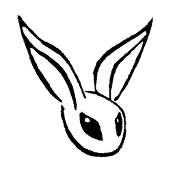
- grindgrain_rabbit_logo_highcontrast.jpg (28.57 KiB) Viewed 30262 times
Since these are good drawings and designs, I think it'd be well worth the few minutes it takes to clean them up and present them.
With a better photo (or using an actual scanner), or finishing your designs with inks or markers, you can get pictures with enough contrast, and then cleaning them up is quick, simple and easy. Learning how to do it takes a bit of time, of course, but once you know what to do, I don't think it'd be more than a few minutes per logo.
Re: Fan Art
Posted: Thu Aug 27, 2015 3:36 pm
by grindgrain
i've never tried anything digital besides "paint" before so i gotta admit that was quite an experience. Throughout several hours everything went into use, two lamps to take a better photo,this very great online editor you mentioned and i found a photocopying in a convenience store nearby! Oh i wish you could see that guy's face when i ran into his shop like crazy "i gotta skan this!" - and gave him three all beat up paper sheets with bunny icons on them, that was so hilarious.
Although i couldn't get them even close to as good as you did in a "quick'n'dirty" kung fu style.They look more like a graffiti on a white wall. But i still hope it is more appropriate now.
I gotta apologize for spamming the images.
Thank you a lot for taking time and for your honest criticism.
Re: Fan Art
Posted: Thu Aug 27, 2015 4:08 pm
by Endoperez
Nice! That's a big improvement already. You don't need to make them all look perfectly professional if that's difficult. It can be recognisably a pencil drawing, that's fine too (and some parts might be intentionally lighter/darker so making it pure black & white loses stuff). Clean background & good contrast already help a lot, and since you got that down, you now know how to make all your stuff look much better.
Did you check tutorials on line art cleanup or did you just experiment on it? I know the tools, but I'm not that experienced on line art cleanup. It's probably worth it to check some tutorials, even if it's for a wrong program, because some of it is likely universal.
The tools I used were probably Levels (change how dark the darkest color values are, how light the lightest, and if the middle gray should be lightened or darkened), Brightness and Contrast adjustment (when adjusted together, you have a good chance of getting the pencil lines out as black and the rest lighter), and just basic brush or pen to remove the last few pixel spots and "dust". If you can get clean outlines, cleaning up dust etc in the mostly-empty areas is very fast. There might be better tools though. Also using softer / darker pencil might help with the contrast, even without inking, especially if you used normal HB pencils or H-anything for these. B2 etc pencils do smudge a bit more, though.
The rabbit in a hat seems like it was digitally redrawn, and is clearly the cleanest. It lost some liveliness though. Digital logos are usually redrawn in vectors, which make them infinitely rescalable without pixelization, but it's different from pixel-using pictures. For that reason I suggest focusing more on traditional drawing with light digital touch-ups and only digitally redrawing the work you think needs it. Making good drawings is a much more useful & fun skill than digitally remaking them.

The one with geometric shapes is hard to get right, there's so many details close to each other so it's no wonder you had trouble with that.
Some stuff is hard, no matter the tool.