I liked his old style better too. I don't buy that he made it more realistic by paying more attention to detail and lighting on it, we often mistake detail for realism but the fact of the matter is that not even photos should be mistook for reality (because they're most definitely not, artists often remove certain features from what they see in order to make it look more realistic in respect to the human eyes attention or lack of attention to detail). Sure his lighting back then could use a little use but now his brushstrokes are less simplified and that saddens me. The simplified brushstrokes were great and now it seems as if he's overworking it (especially since using texture brushes) making the brushstrokes slightly cluttered and it becomes sort of a bad hybrid of speedpainting with texture brushes and painting with simplified brushstrokes. To me it loses a lot of its charm and it becomes more cluttered.
Re: Fan Art
Posted: Sat Sep 17, 2011 8:57 pm
by Korban3
Hm, I like the simple strokes of before as well, but he didn't always make them simple. He kind of mixed it up. Sometimes it was simple, other times it was pretty detailed. I just like that he is improving his technique. And if he's happy with it, then it's fine by me. If he hates better lighting attention, then I don't want him paying more attention to his lighting. Wouldn't want anyone doing something they hate.
Re: Fan Art
Posted: Mon Sep 19, 2011 8:15 am
by Silverfish
I finally finished my fan art drawing!
Click it for full size (1680 x 1050)
Turner fighting a wolf in the arena
EDIT:
Updated with color corrected image.
Also, might add that it took 20-24 hours to create this image.
Re: Fan Art
Posted: Mon Sep 19, 2011 8:27 am
by nutcracker
Omfg is so good!?
Ps. if you zoom in on the wolf you can see that he is retarded.
Re: Fan Art
Posted: Mon Sep 19, 2011 1:23 pm
by WildboarOG
Wow
Niiice! that's "super awesome"!!!
Ps. nutcracker, I dont think he's retarded, he just got beaten by Turner...like...really badly.
Re: Fan Art
Posted: Mon Sep 19, 2011 9:33 pm
by Fidchell
Silverfish wrote:I finally finished my fan art drawing!
Click it for full size (1680 x 1050)
turner_arena.png
EDIT:
Updated with color corrected image.
Also, might add that it took 20-24 hours to create this image.
Very nicely done. The lighting is rather well-executed. Speaking of lighting, I was painting up another picture of Turner with lighting practice in mind. Not very detailed, but this was pretty much a quick one.
Re: Fan Art
Posted: Tue Sep 20, 2011 6:36 am
by HiNathan
Here's my rat...thing. I really have no idea. I'm diggin' the art above me. So sweet everyone!
Re: Fan Art
Posted: Tue Sep 20, 2011 5:02 pm
by Fidchell
HiNathan wrote:
Here's my rat...thing. I really have no idea. I'm diggin' the art above me. So sweet everyone!
I love the smoothness of the shading. Very clean work!
Re: Fan Art
Posted: Tue Sep 20, 2011 5:06 pm
by Korban3
Fidchell: Looks pretty good, although it looks like he's shrugging his forward shoulder too much. But I like it, and the lighting was really cool on the edges. Cool painting overall.
HiNathan: ._. Scawwy. That rat thing is ripped. It feels like the length of the spear could be less stark and just a little softer. The edge of the right ear, in front of the spear could use a really light softening too. That's my only criticism, except that it's scawwy.
Re: Fan Art
Posted: Wed Sep 21, 2011 10:04 pm
by Fidchell
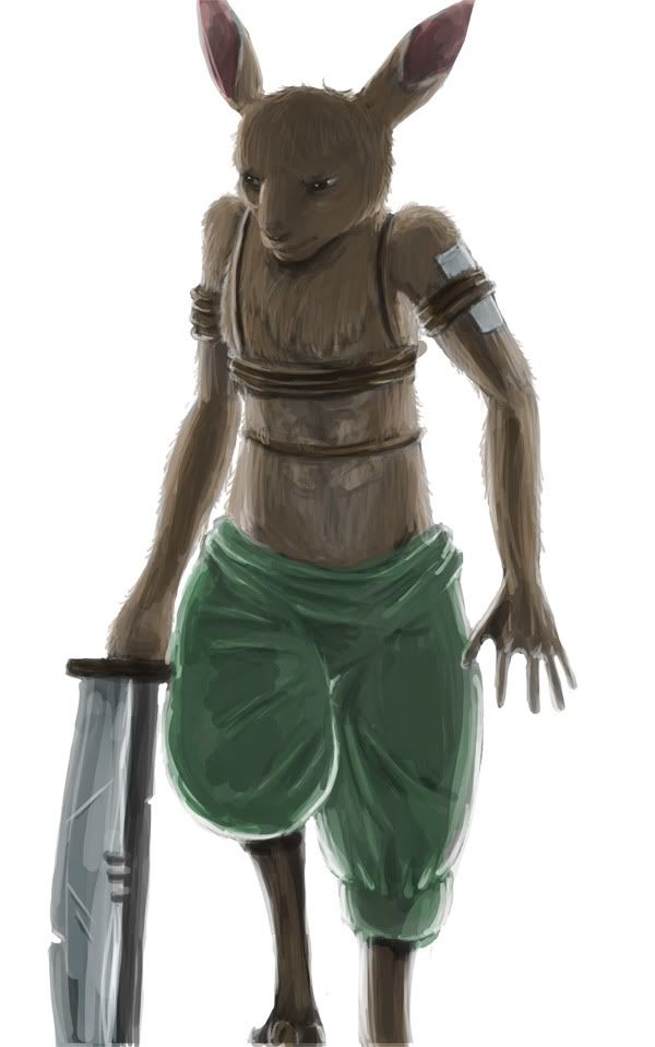
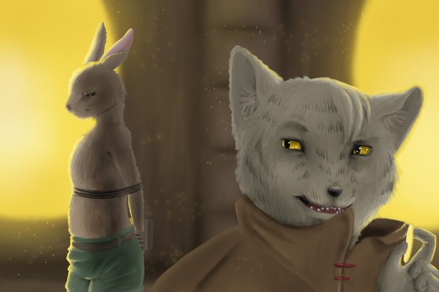
Here's something I've been doing for the past couple days.
It's just a little spinoff scenario from my crazy imagination. In a nutshell, a group of bounty hunters manage to ambush and capture Turner and they take him to a greedy cat who uses him as a fighting contestant in the arena to earn some serious cash, rather than turn him in dead or alive. Tell me what you guys think. I tried to give it a "cutscene" feel. Maybe I should've added blinds.
Re: Fan Art
Posted: Wed Sep 21, 2011 10:57 pm
by Korban3
O NOES! DEY CAPCHA'D TURNER!
I like the cat, he's cool. And that fwif of hair is just enough to make me not like him. Gives him that "Yeah, I'd buy you from bounty hunters and use you to earn some serious cash in the arena instead of turning you in," sort of feel.
Cool picture and yes, I am going to whine about the shape of Turner's head not being the way I'd do it, but it doesn't matter 'cause it's still a cool picture. I like the background. It works. Your lighting is pretty good and you do eyes well too. Is awesome.
I think the way Turner is made closer to the blurred background and a little softer edged makes the cat a strong focal point. He stands out to the eye a lot more because of his sharpness and color. I dunno if this is what you were going for, but it's how it seems to me.
Re: Fan Art
Posted: Thu Sep 22, 2011 8:07 am
by BurninatorX
Just an image I made for the fan art watch of OG Weekly. Cus I love those guys and I'm always watching in archives because I either forget or cant make it to the live stream.
Hope you like it. Love the show, watch it every week in the archives looking forward to seeing my fan art in next weeks show when I yet again watch it in the archives haha.
also last thing, cus idk where I should post this and I'm sure you will see it during the show, Bioshock would be a great game for the post show if you haven't played it, or Singularity which is kinda similar but a great game if you ask me
-Nic
Re: Fan Art
Posted: Thu Sep 22, 2011 3:36 pm
by Fidchell
Korban3 wrote:O NOES! DEY CAPCHA'D TURNER!
I like the cat, he's cool. And that fwif of hair is just enough to make me not like him. Gives him that "Yeah, I'd buy you from bounty hunters and use you to earn some serious cash in the arena instead of turning you in," sort of feel.
Cool picture and yes, I am going to whine about the shape of Turner's head not being the way I'd do it, but it doesn't matter 'cause it's still a cool picture. I like the background. It works. Your lighting is pretty good and you do eyes well too. Is awesome.
I think the way Turner is made closer to the blurred background and a little softer edged makes the cat a strong focal point. He stands out to the eye a lot more because of his sharpness and color. I dunno if this is what you were going for, but it's how it seems to me.
Awesome! I'm glad that the cat gives you that feeling just by looking at him. I love trying to tell a story through my pictures more often than not.
I actually tried improving a bit on the Turner's head. Thought it'd be noticeable. Ah well. But thank for you the compliments! About the blur, that is actually exactly what I was going for! I'm glad you noticed!
Re: Fan Art
Posted: Thu Sep 22, 2011 4:59 pm
by Korban3
No, the head does look better, to me at least. I just wasn't going to go on a paragraph rant about the underlying bone anatomy of rabbit skulls, general shape, sihlouettes, (Once again, word, your spelling hath eluded mine grasp! Fie, fie! 'Tis not granted that I shouldst spell thee proper, but that I twas destined to forever hold thine slippery synonyms in my darkened visage! Never to see thee in the correct light of grammar, twas I meant, for thou art vague against the background of my mind and 'tis no difficult part in the great scheme of life upon a stage to miss thee through the pinhole of the English language.) and all that jazz. But it does look very good. I just do my rabbit heads differently and was just stating so in a mild rejection of art advice
If it's your style, then don't worry about it because your pictures do look good. I've been all "But it should be an acorn!" for a little while, but if it's just not how you do it then you do what you would do, and do it how you would do it.
Please note the very first lines of this song's lyrics.
Re: Fan Art
Posted: Fri Sep 23, 2011 11:11 pm
by hunting dog
Sorry for being gone so long. School and stuff. But I'm back. So here is my ghillie suited rabit. enjoy! For all that it matters, stay beautiful!