i honestly feel like i would have to start from scratch to be satisfied.
my brother seemed to take to it rather quickly though so i will just leave it at that until i feel like making a pro layout for him. the image does look a lot better bigger though, check out that myspace link in the bottom of that post, its larger on that page.
something about me just liked those stripes though. thanks for the input endo.
tomorrow i think i will either scrap the stripes and go for a more grunge backdrop. the same would be done to the pug too.
The Art Thread - Where did everyone go?
-
underthedeep

- Posts: 1099
- Joined: Tue Apr 27, 2010 7:18 pm
- Location: southern california
- Contact:

Re: The Art Thread - Summer Workshop?
Logos are a tricky thing to get right. Some of you might have noticed I just recently update my personal logo, but it really took a long time to really get it right. I'm no artist by any means, so I had to hire someone, but there was a lot of back and forth coming to the final product. If it interests you, here's the final product, and then links to the development ideas:
Final:

First round: Just some basic ideas my graphic designer came up with. It was the preliminary idea, and helped me hire him.
http://antonriehl.com/overgrowth/public ... godev1.jpg
First Reply: So I liked some of the things he did, and wrote back some comments with my horribly bad drawings attached.
http://antonriehl.com/overgrowth/public ... odev2.jpeg
2nd Round: So I really must have said a lot in that email, because he came back with a wide variety of options, including some that I really just didn't like. What I realized I wanted to focus on after getting this back was to keep the logo sleek and simple. I did see a few strong lines that I really responded to.
http://antonriehl.com/overgrowth/public ... godev3.pdf
3rd Round: I believe we did a conference call and did a lot of screen sharing to get to the next round, but this was the first round that you can see a very distinct similarity to the final product:
http://antonriehl.com/overgrowth/public ... godev4.pdf
3rd Round part 2: My designer had added this last one as a late submission, and that's all it ever was:
http://antonriehl.com/overgrowth/public ... godev5.pdf
3rd Reply: I did some more sketching along with my a close friend, discussing what usually goes into a logo... unfortunately I got a little excited while working with him, and we started to go off into ideas that weren't really related to the original idea...
http://antonriehl.com/overgrowth/public ... godev6.jpg
4th Round: The result of my thoughts ended up with a bunch of bad looking brush strokes... but I saw the shape of the R that had never been there... so it was a needed step:
http://antonriehl.com/overgrowth/public ... godev7.pdf
4th Reply: So I saw something I liked, and started playing tape the objects together. Sadly my hand drawings really didn't turn out, but the message came through.
http://antonriehl.com/overgrowth/public ... godev8.jpg
5th Round: So we did our last round of revisions again with a screen to screen chat, and we came up with the final version. We then decided to look at color schemes. I can tell you that color is not always definite while dealing with screens. While we were working, I took a screen shot of his computer (left) and when I received the touched up version, was shocked to see totally different colors staring back at me (right).
http://antonriehl.com/overgrowth/public ... godev9.png
Sorry if that was a little boring in this thread...
Final:
First round: Just some basic ideas my graphic designer came up with. It was the preliminary idea, and helped me hire him.
http://antonriehl.com/overgrowth/public ... godev1.jpg
First Reply: So I liked some of the things he did, and wrote back some comments with my horribly bad drawings attached.
http://antonriehl.com/overgrowth/public ... odev2.jpeg
2nd Round: So I really must have said a lot in that email, because he came back with a wide variety of options, including some that I really just didn't like. What I realized I wanted to focus on after getting this back was to keep the logo sleek and simple. I did see a few strong lines that I really responded to.
http://antonriehl.com/overgrowth/public ... godev3.pdf
3rd Round: I believe we did a conference call and did a lot of screen sharing to get to the next round, but this was the first round that you can see a very distinct similarity to the final product:
http://antonriehl.com/overgrowth/public ... godev4.pdf
3rd Round part 2: My designer had added this last one as a late submission, and that's all it ever was:
http://antonriehl.com/overgrowth/public ... godev5.pdf
3rd Reply: I did some more sketching along with my a close friend, discussing what usually goes into a logo... unfortunately I got a little excited while working with him, and we started to go off into ideas that weren't really related to the original idea...
http://antonriehl.com/overgrowth/public ... godev6.jpg
4th Round: The result of my thoughts ended up with a bunch of bad looking brush strokes... but I saw the shape of the R that had never been there... so it was a needed step:
http://antonriehl.com/overgrowth/public ... godev7.pdf
4th Reply: So I saw something I liked, and started playing tape the objects together. Sadly my hand drawings really didn't turn out, but the message came through.
http://antonriehl.com/overgrowth/public ... godev8.jpg
5th Round: So we did our last round of revisions again with a screen to screen chat, and we came up with the final version. We then decided to look at color schemes. I can tell you that color is not always definite while dealing with screens. While we were working, I took a screen shot of his computer (left) and when I received the touched up version, was shocked to see totally different colors staring back at me (right).
http://antonriehl.com/overgrowth/public ... godev9.png
Sorry if that was a little boring in this thread...

Re: The Art Thread - Summer Workshop?
Woww, that was great!  It was really nice seeing how the product was fine-tuned little by little.
Re: The Art Thread - Summer Workshop?
Cool, glad you liked it. I was happy in the end, but it was weird how it never felt finished until we were actually done. Just goes to show that sometimes you just have to keep refining and refining. Initially I was hoping that he would give me like 10 ideas, and then I'd just pick one, but it never worked out that way.

Re: The Art Thread - Summer Workshop?
Well, while we're on the topic of logos, here's one I whipped up yesterday for my friend's project.

I also posted the early iterations on my blog if you care to see them: http://gabrielverdon.com
I also have a few others up there if you look at some of the earlier posts.
@Anton: Yeah, I find that's typically how it is with graphic design. I almost never get it right the first time, and more often then not, the first few tend to be pretty terrible. But that's ok! It makes the end product all the better. Also, I think whoever designed your logo did a great job.
-
underthedeep
- Posts: 1099
- Joined: Tue Apr 27, 2010 7:18 pm
- Location: southern california
- Contact:
Re: The Art Thread - Summer Workshop?
@anton and cosec
i concur, usually always takes multiple takes.
and cosec that logo looks really badass.
good job!
i concur, usually always takes multiple takes.
and cosec that logo looks really badass.
good job!

Re: The Art Thread - Summer Workshop?
Cosec: Totaly love it! nice work!!
-
underthedeep
- Posts: 1099
- Joined: Tue Apr 27, 2010 7:18 pm
- Location: southern california
- Contact:
Re: The Art Thread - Summer Workshop?
me and my friend recorded 2 songs from our "project band"
tiz not visual art, but music is still an art form
you listen to them here
http://deflower.bandcamp.com
tiz not visual art, but music is still an art form
you listen to them here
http://deflower.bandcamp.com

Re: The Art Thread - Summer Workshop?
Haha, that kicks ass!
Also, I've never seen the Bandcamp site before, I'll keep it in mind. Thank you.
Also, I've never seen the Bandcamp site before, I'll keep it in mind. Thank you.
-
underthedeep
- Posts: 1099
- Joined: Tue Apr 27, 2010 7:18 pm
- Location: southern california
- Contact:
Re: The Art Thread - Summer Workshop?
yeah its quite a handy site, you can use it to sell your music too.
Re: The Art Thread - Summer Workshop?
Yeah, I noticed.
If the friends and I ever create a band and upload a song, I'll let you know :]
If the friends and I ever create a band and upload a song, I'll let you know :]
Re: The Art Thread - Summer Workshop?
Bump...
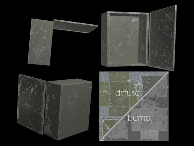
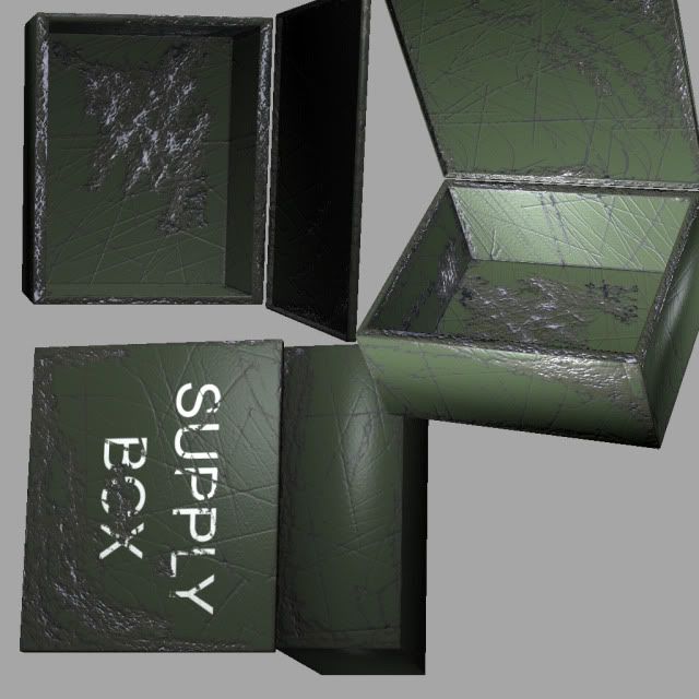
Now that's more like it! Two quite nice textures, the first was the first time I tried this method, the second is still WIP. It will need dust and dirt and grime and grunge.
How to break an egg helped me learn how to use Photoshop intelligently and saved me lots of time. Ctrl+J, Ctrl-clicking on a layer's preview image, lots of tricks one can do with combining selection, fill, inverted selection and move tools; custom brushes, gradients for fun and profit...
Hard Surface Texture Painting, on the other hand, shows what kinds of stuff there is in a good texture. All I've done so far in the boxes above has been very simple variations on basics laid out in this tutorial.
Re: The Art Thread - Where did everyone go?
I've been otherwise occupied for the last week or so, getting some exercise and firing with a recoilless rifle, but I now have time for artsy stuff again.
Tomorrow, I'll go get some stuff including learning materials, and I think I'll also go and see if I can find any Copic markers. I have very little experience with markers, but these seem very good and, more importantly, they are refillable which should cut down the costs somewhat. I've only tried a few markers before, and they ran out of color very fast. If someone happens to have lots of experience in this area, I'm open for suggestions. I'm going to draw with the brush tip, and try out what kind of lines that'll let me do.
I'm also going to do some painting, and I have to say the easels (easel = platform that supports the canvas) I've seen so far haven't impressed me. I haven't tried oils or painting to an actual canvas yet, but for gouache and watercolor painting, I'd like to have a strong, stable base where I could attach the paper, and this is pretty much impossible with the common three-legged easels. To avoid the colors dripping downwards, the angle should also be adjustable. The flimsy easels also look like they'd fall over if there's any kind of wind at all. Again, if anyone happens to have experience in the area, recommendations would be welcome.