oh come on Endo!
Couldn't we just enjoy this cool painting? ^^
why are ...? noooo! that's just a joooke! aaah! *whoosh!*
Fan Art

Re: Fan Art
What endo does is constructive feedback. (Dunno just changed it from constructive criticism)grindgrain wrote:oh come on Endo!
Couldn't we just enjoy this cool painting? ^^
why are ...? noooo! that's just a joooke! aaah! *whoosh!*
-
grindgrain
- Posts: 41
- Joined: Fri Jun 19, 2015 1:45 pm
Re: Fan Art
i know, rodeje ^^
that wasn't supposed to sound mean in any way, sorry.
that wasn't supposed to sound mean in any way, sorry.
-
renamedperson
- Posts: 303
- Joined: Thu Jan 02, 2014 6:38 pm
- Location: Chilly China
Re: Fan Art
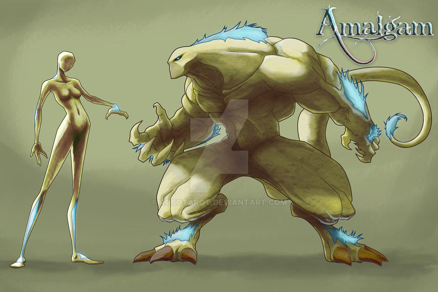
Hey all. I haven't been on for quite some time. Every once in a while I lose interest but that latest video got me back into it. Here are several drawings based on a single character. Tell me what I could improve!
-
neri_creature

- Posts: 1
- Joined: Sat Nov 14, 2015 7:10 pm
- Location: wilderness
Re: Fan Art
Discovered this project recently and since then I haven't been able to get it out of my mind!
Last edited by neri_creature on Thu Mar 02, 2017 9:34 pm, edited 1 time in total.
-
renamedperson
- Posts: 303
- Joined: Thu Jan 02, 2014 6:38 pm
- Location: Chilly China
Re: Fan Art
Those look pretty nice. Very neatly done and it has good style.

Re: Fan Art
Oooooh, very nice, I certainly dig that style, and the use of shading. Very iconic.neri_creature wrote:[img]
Here a drawing of all current overgrowth races. Critics and thoughts are welcome.
Criticism, criticism, let's see, er...
The rat looks a bit mousey? That's all I can come up with for now.
Thank you for sharing.
-
renamedperson
- Posts: 303
- Joined: Thu Jan 02, 2014 6:38 pm
- Location: Chilly China
Re: Fan Art
This art I am particularly proud of.

Re: Fan Art
Is it ok to repost? I posted this a while back, but I don't think anyone really saw it, so I'll try again. 
- Attachments
-

Re: Fan Art
Nice @ Daxtart and RylanLego.

Re: Fan Art
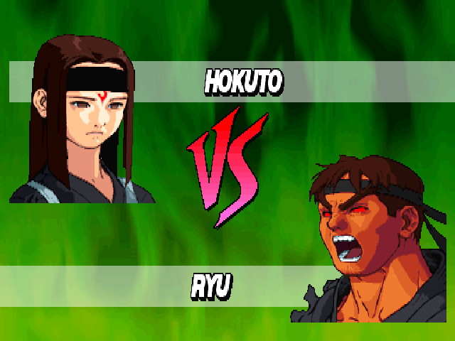
It's very cartoony in style, but I don't know much about that. I can't even point at any shows that use this style, althought the eyes and the pose do seem familiar.RylanLego wrote:Is it ok to repost? I posted this a while back, but I don't think anyone really saw it, so I'll try again.
The only pieces of advice I can give are:
1) the lines aren't that smooth. The straights aren't exacly straight but a bit jagged. The curves aren't even. That sort of thing. That'd improve it. The easiest way would be to use a different program, I guess - there are programs for drawing that automatically clean up and smooth any drawn lines.
2) The text is boring. The VS in the center is nice, but "Turner" and "...Wolf" are boring, and your creator tag is almost illegible. If you're interested, you could look a bit into typography. Typography is the skill of using what the text looks like to convey messages, in addition to what the text actually says.


Re: Fan Art
The poses are pretty good. Not, like, flawless professional quality, but the anatomy is more or less there, the poses are interesting, there's action that's easy to read etc. Good stuff!daxtart wrote:This art I am particularly proud of.
I'm not very good on anatomy or character stuff. You could always work a bit more on the perspective of things, work on fingers, muscles etc. Or... you could try to do more stuff with shading.
You have a bit of shading in there, but not enough for it to actually make an impression. Make it bold! This is a bit exaggerated and simplistic, but I think it's easier to learn by exaggerating things a bit.
Also, that green hue doesn't do it any favours. If it's a smart phone photo or something like that, there's probably an app for color correction.
I do stuff digitally, so if you have some digital painting software I can give you tips on the order of layers I had in there. If you want to work using traditional tools, I guess you'd use a medium gray or dark gray marker to paint the equivalent of "Raw data - character shading" portion... on top of your lineart. Drawbacks - you have to draw on top of your lineart, so mistakes hurt.
Also, you could start looking into simple backgrounds. Foreground - midground - background. One is light, one is dark, one is in-between.
Image is from here: http://acting-for-comics.tumblr.com/pos ... sics-value .
-
renamedperson
- Posts: 303
- Joined: Thu Jan 02, 2014 6:38 pm
- Location: Chilly China
Re: Fan Art
Wow! thanks for the tips. The reason that It looks green is that I actually drew it and coloured it on a green paper. I scan the images in with my scanner so they are high resolution but then I basically fudge that up. I will try what you said and post my results.
Re: Fan Art
Okay, sorry about that. I thought it might've been colored paper, but Photoshop magically removed the green so I thought it might've been just the photo. Seems not. Magic! Bah. Can't trust it.daxtart wrote:Wow! thanks for the tips. The reason that It looks green is that I actually drew it and coloured it on a green paper. I scan the images in with my scanner so they are high resolution but then I basically fudge that up. I will try what you said and post my results.
Drawing on colored paper sounds like fun but as I said, the green didn't really do any favours for this image. The colors looked muted and dull as if looked at through a green fog. If you can get colors looking better on it, there's less need for a background though. Especially if you can draw LIGHTER than the background.
What are you using for the colors? Do you have anything that can push colors further away from green? I'm not very good with colors, but I assume it will be harder to get white looking pure white, and it would take some trial and error to get specific hues with traditional tools.
I looked up some random pieces of art with green background. It seems like using a different green is pretty common. Brighter and richer, or darker and more dull green than the background. Blues seem to work well, both saturated rich blues and light, cyan-tinted blues. Reds also work, of course, being on the opposite side from green on the color wheel. Browns seem to not work as well.
You don't need to do full out backgrounds, but having a bit of a hint of something that's green and isn't a perfectly even hue of green would help turn them from characters to scenes.


-
Retarded Username

- Posts: 491
- Joined: Tue May 08, 2012 6:00 am
- Location: Going over the Trump wall
Re: Fan Art
Think you'd benefit from using something like Illustrator for the jagged edges.RylanLego wrote:Is it ok to repost? I posted this a while back, but I don't think anyone really saw it, so I'll try again.